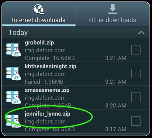
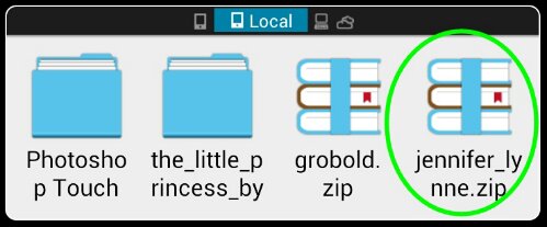
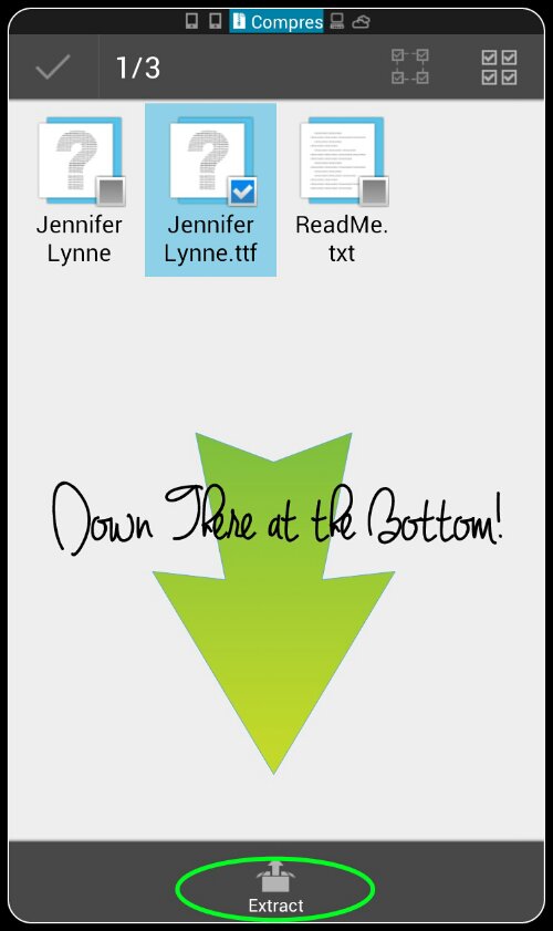
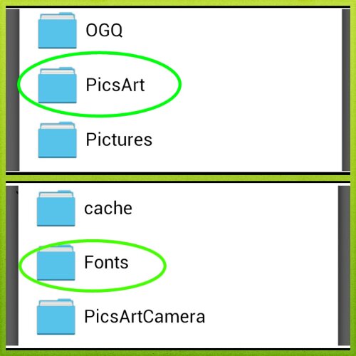
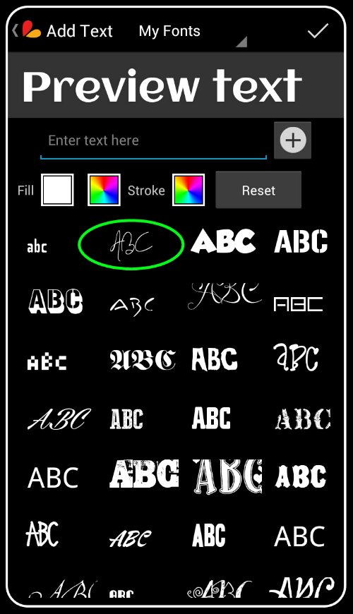
Good morning! I sure hope everyone slept well! Did you get all of the fonts you wanted installed? (If you’re having any trouble, please ask for help! You can also check out PicsArt’s very own tutorial found HERE.)
Moving on, this tutorial is part one of a two-part series on using Layers. In this tutorial, we will concentrate solely on using layers in PicsArt. Stay tuned for Part 2 if you have a copy of Photoshop Touch!

Layers are exactly what they sound like. Using layers in a design creates a more three-dimensional effect where as no layers leaves your image flat.
Here, let me show you visually.
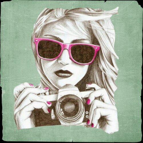
No Layers:

With no layers, the girl looks like she was printed on the paper.
Now, check out the Timeline Cover I created for
“Because moms are sexy too” last night.

This design used a total of 41 layers. Can you find them all?
Notice that the second design looks like someone scrapbooked it, making it pop and more pleasant to the viewer.
Unfortunately, PicsArt only allows you to use a total of 5 layers, so if you need to keep going, you’ll have to merge some of the ones you’ve started. (We’ll cover this, promise!)
For today’s tutorial, we will be creating an email signature like this one.


1: Two backgrounds/Scrap-Papers of your choice that compliment each other.


I used these. I did NOT create these but for the life of me, I can’t remember where I got them. If you know, please inform me so I can give credit.
*Please feel free to follow this tutorial exactly for learning purposes. This includes downloading and using the same images that I did.
2. Some sort of .PNG or other transparent image to use as your main element. I decided to use a word art, again, need to know the original creator to give proper credit:

If the PNG version of the word art doesn’t download for you, it can also be downloaded
here.
Once you have all of these together, it’s time to get started!

To get started, prepare the proper canvas.
For each design you create, it always pays to do the research on the standard image size for the image you want to create.
No one wants to open an email from you and sit there waiting several minutes for it to load, just because you decided to get all artsy and attached an image that was larger than the actual body of your message!
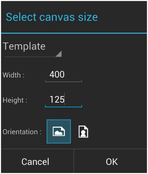
Because of this, I use a blank 400 (width) x 125 (height) canvas for my email signature.
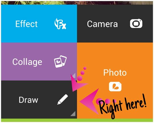
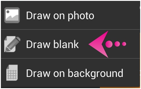
To do this, open PicsArt, choose Draw/Draw Blank, enter your dimensions, and click ok.
The first step I ALWAYS do when working on Layers in the PicsArt app, is to remove the very first layer, or the “background” layer. I always fill up all that white space anyway, and when I DON’T, I want it transparent.
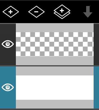
To remove a layer, first make sure you have THAT layer selected. There is no undo button in PicsArt for a deleted layer. While that doesn’t matter much right this moment, if you have an intricate design on the selected layer, it is possible to lose hours of work. I know this, firsthand. I do it frequently.
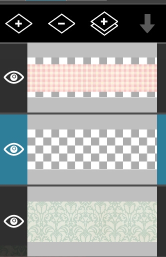
For example, in this image, the layer I wish to remove is NOT selected:

The blue highlight needs to be on any layers you choose to edit, whether by deleting, or later, blending:

Once selected, clicking that little Minus icon at the top of those screenshots will remove the layer, leaving you with a now empty canvas to play with.
But don’t back out of layers yet! Now we get to add our two backgrounds/Scrap Papers.
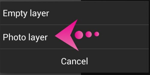
Right beside the minus icon, click the plus icon, and choose to add a photo layer.

And this is where PicsArt surpasses Photoshop Touch in my opinion.
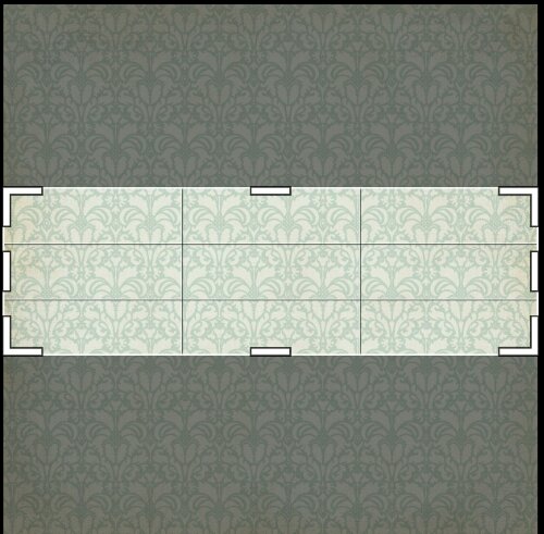
Once you select the first background you’d like to use, this screen pops up:

PicsArt AUTOMATICALLY sets your crop to fit the exact dimensions of your image. I usually zoom in a little bit to make the pattern a bit more clear.
Simply spread two fingers apart on your screen until you’ve reached the desired effect, then click the check mark.

And there’s your new background layer!
(Just leave the bottom transparent layer alone. We will be using it later.)
Now, repeat this process all over again: Add Layer/Photo Layer/Select SECOND Background/Zoom (Optional)/Apply.

Now the second background is covering the first, so guess what? You finally get to leave those layers for just a minute.
But first, make sure your top layer is selected. Just double-check. Remember: Anytime you plan to edit a layer at ALL, make double sure you have THAT layer selected.
Trust me. Learn from my many swear words.
After checking, just click your phone’s back button to close the layer view.
This is where you might want to zoom in on your design, as we are about to remove the unwanted areas of our second background.
At the top of your screen, click the eraser tool. It looks like

.
Now, we could erase what we want by hand, but face it, no one I know can draw a straight line on a mobile device.
PicsArt anticipated this.
Down in the middle of your screen, click your Shapes tool →

I tend to stick with the rectangle, filled, but by all means, feel free to play with the different shapes and filled or stroke. If you don’t like it, just click the undo button at the top left. →

Using the rectangle shape, filled, I removed the top portion and bottom portion of the third layer, leaving my original background peeking through like so.

Now, our design still looks flat. Unfortunately, since we are using PicsArt, we have no drop shadow effect.
What we do have, however, are drawing tools, and a transparent layer at the bottom to play with.
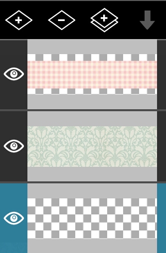
So go and open your layer view back up, and select the very bottom layer, which SHOULD be transparent.

We are going to draw a drop shadow on this layer, but FIRST, we have to slide it in between the two backgrounds.
To do this, simply long press on it, and drag it into position.

Now, leave the transparent layer selected so that we can draw BEHIND the pink background (what’s a drop shadow if it’s in FRONT?) and back out of layers.
Up at the top of the screen, your eraser will still be selected. Switch back to the paintbrush, then go back down to your Shapes tools and choose a filled rectangle, black. (Even if you used this shape earlier, you need to re-enter shapes and click OK.)
You’ll draw a thin shadow below the last layer. No worries. Anything drawn BEHIND this layer will never be seen again.
In this image, I used a stroke on TOP of the second background to show you where my rectangle typically gets drawn.

I then repeat at the top (personal preference comes into play here – where you draw the drop depends on where you want the light to be shining on your design or to be more precise, where YOU think it looks good.)
This is my result.

I don’t know about you, but those shadows look awfully FAKE to me.
We CAN fix it though. Yet again, HOORAY FOR LAYERS!
Open up your layers, and select the layer with the shadow on it.
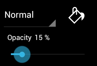
Down at the very bottom of your Layers view is a drop down menu with blending modes, a paint bucket, and opacity.

For now, play with the opacity bar until your shadows reach a level that you are happy with.
I used 15% to get this result.

Guess what? The background of your design is complete.
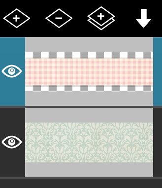
Go ahead and merge the Checkered part with its shadow, so nothing can somehow get between them. Together forever.
Hehe. I made myself giggle! Moving on, merging is simple.
As we are only merging two layers, simply open up your Layers view and select the highest layer that you wish to merge (your pink checkered pattern) and then click the arrow that is pointing down at the top of your Layers view. (This is the Merge Down icon. It will merge whichever layer you have selected, dowqn one layer and combine the two.)

Note to the reader: If you are following my tutorial exactly, go ahead and merge down one more time.
If you are creating your own design, try adding in some flourishes or doodles between the layers. Play around a bit. Have some fun!
Guess what? The background of your design is complete! We are almost finished!

Now to add your main element. First, click the PLUS button at the top of your layers, and add an EMPTY LAYER. You won’t be using the Photo Layer this time, because you will want to scale/position your clip art.
Instead, use the Add Photo tool at the bottom of the screen. →

Crop if needed, and then scale and position where you’d like it to be. WARNING: If you click OUTSIDE of the border, that is where your clip art will stay. Please be careful.
Mine:

Special Note:
I didn’t like that the word art was so incredibly light, so here’s a bonus tip. If you are happy with it, skip these steps.
When an element is on a layer by itself, and is too light, it CAN be darkened.
Follow these steps:
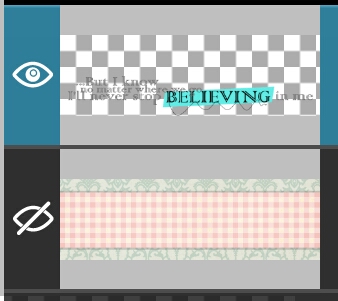
1. Hide ANY other layers beside the one you wish to darken. You do this by clicking the Eye next to each layer.

2. Duplicate the layer that you wish to darken. →

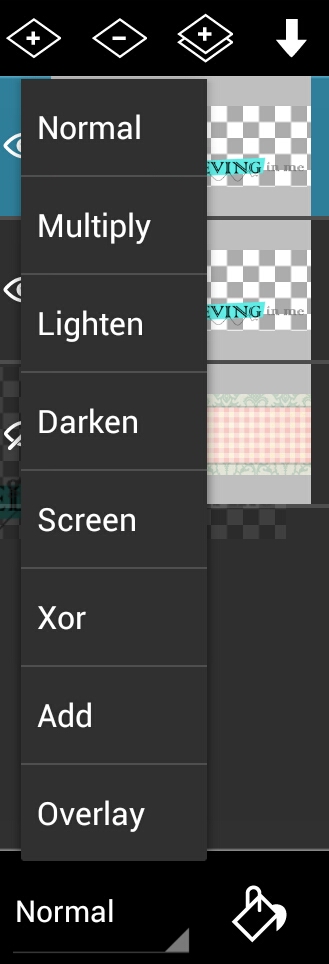
3. Select the New Layer, and down at the bottom, choose Blend Mode “Multipy”. If you haven’t hidden any of the other layers, they will all disappear. Just go through and hide them before merging.

Did you notice that it got darker?
4. Duplicate the new layer until you are satisfied or you reach the layer limit. Starting with the top layer, merge down, being careful not to merge into any hidden layers.
5. REPEAT ALL STEPS UNTIL YOU ARE SATISFIED. If you duplicate a layer and the colors change dramatically, remove that layer using the minus button, and merge down. No more darkening can be achieved.
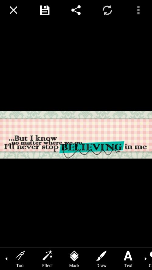
Once your main element is on, and I’m the future, all embellishments, etc, and you are 100% satisfied with your design, you may click the check mark at the top right of your screen. This flattens your image, and brings you to PicsArt’s main editing page.

Add your text, and then click save. I prefer to save my images as PNG. I feel they have more clarity in this format.
MY FINISHED SIG:

So.. how was it? Did you learn anything new?
If anyone needs help, or would like to send me your lovely results, there are a multitude of ways to contact me:
Comment here.


